
In today’s digital landscape, crafting moments that captivate users is essential for maintaining engagement and fostering loyalty. Microinteractions are one of the most effective ways to achieve this subtle yet significant delight. These small, often overlooked animations or responses—such as toggling switches, confirming likes, or providing visual feedback on form inputs—play a powerful role in shaping user perception and guiding behavior.
Currently, teams across industries recognize that static interfaces fall short of modern expectations. Users demand interfaces that feel alive, intuitive, and responsive. When well-executed, microinteractions bridge the gap between utility and emotion, transforming routine tasks into memorable experiences. This year (2026), embracing microinteractions has become a strategic priority for product teams aiming to stand out in an oversaturated market.
In this comprehensive guide, we’ll dive into what microinteractions are, explore their key components, discuss best practices for design, highlight essential tools and techniques, and examine strategies for testing, measuring success, and looking ahead to future trends. Whether you’re a seasoned designer, a developer exploring motion, or a product manager seeking deeper engagement metrics, understanding microinteractions can elevate your digital product to new heights.
What Microinteractions Are and Why They Matter
Microinteractions are brief, single-purpose animations or feedback loops that occur when a user interacts with a product. Coined in design circles by Dan Saffer, the term refers to those fleeting moments—often lasting less than a second—that confirm, guide, or delight users. Triggers might include tapping a button, swiping across an image, receiving a push notification, or pulling to refresh content on a feed. Although each microinteraction is small in isolation, collectively they shape the overall user experience and perception of a brand.
Today, microinteractions serve four primary roles: providing feedback, signaling status, guiding users, and reinforcing brand identity. For example, a subtle color shift on a “like” button confirms success without disrupting flow, while a loading spinner reassures users that a request is processing. A playful bounce or fade can surprise users in a pleasant way, creating emotional connections that transcend mere functionality.
According to studies in human-computer interaction, interfaces enriched with thoughtful microinteractions can boost user satisfaction by up to 20% and improve task completion rates. In today’s digital landscape, where attention spans are short and alternatives are abundant, these small touches can make the difference between a user abandoning an app or becoming a loyal advocate.
Components of Effective Microinteractions
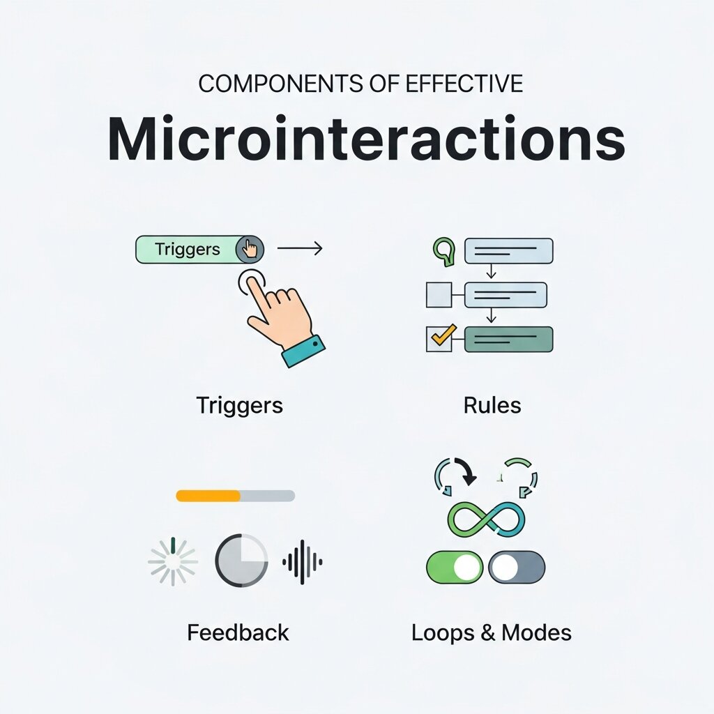 Every impactful microinteraction can be broken down into four core components: trigger, rule, feedback, and loop or mode. Understanding each part ensures that your microinteractions are not only delightful but purposeful and accessible.
1. Trigger
The trigger initiates the microinteraction. Triggers can be user-driven (click, swipe, drag) or system-driven (incoming message, timer). Designing discoverable triggers without cluttering the interface is crucial. Subtle affordances, such as color changes on hover or slight shadows under buttons, hint at interactivity and encourage exploration.
2. Rule
Rules determine what happens after the trigger fires. They govern logic like the sequence of animations, conditional states, or transitions between views. Keeping rules simple and consistent across your product prevents confusion and reduces cognitive load. Complex rules may require clear documentation and careful testing to ensure predictable behavior.
3. Feedback
Feedback reassures users that their action has been recognized. It can be visual (color shifts, animations), auditory (click sounds), or haptic (vibrations). The choice depends on context and device capabilities. For mobile apps, combining visual feedback with light haptic pulses can enhance the sense of physicality and control.
4. Loop & Mode
Loops and modes define whether a microinteraction is continuous or state-based. For example, an infinite spinner indicates ongoing processing, while a toggle switch has two distinct modes (on/off). Clear state transitions and exit points prevent users from feeling stuck. If a spinner loops indefinitely, provide a cancel option to maintain control and trust.
By meticulously designing each component, teams create microinteractions that are both delightful and purposeful, leading to more intuitive and engaging user experiences.
Best Practices for Designing Microinteractions
 Implementing microinteractions effectively requires a careful balance between creativity and restraint. Overuse or excessive complexity can distract or frustrate users, while underuse may result in dull, unresponsive interfaces. Below are key considerations to guide your design process.
1. Keep Every Interaction Purposeful
Before adding an animation, ask: “Does this improve clarity, feedback, or delight?” Each microinteraction should serve a defined goal, such as indicating progress, acknowledging user input, or reinforcing brand voice. Gratuitous motion can clutter the interface and slow performance.
2. Maintain Consistency
Uniform timing, easing curves, and style across all microinteractions create a cohesive experience. Consistency reduces learning overhead by making motion patterns predictable. Establish a design system or motion library documenting curves (e.g., ease-in-out), durations, and component guidelines to ensure team alignment.
3. Optimize for Performance
Smooth playback at 60fps is critical for perceived quality. Use hardware-accelerated CSS transforms and transitions whenever possible. Minimize layout thrashing by avoiding animateable properties that trigger reflow (e.g., width, height). Consider fallback states for older browsers or low-power devices.
4. Provide Clear Feedback
Users should never be left wondering whether an action succeeded. Visual indicators—such as checkmarks, progress bars, or toast messages—communicate status effectively. Complement visuals with subtle sound cues or haptic feedback on supported devices to reinforce clarity.
5. Embrace Subtle Motion
Subtlety enhances immersion. Aim for brief durations (150–300ms for simple transitions) and small movement distances to prevent distraction. Gentle easing curves like “ease-out” for exiting states or “ease-in” for entering animations ensure natural rhythm.
6. Prioritize Accessibility
Offer a reduced-motion option for users sensitive to movement. Respect operating system preferences by honoring CSS media queries such as prefers-reduced-motion. Provide alternative interactions or static states when necessary to accommodate a wider audience.
Tools and Techniques for Creating Microinteractions
A diverse set of tools can streamline the design and development of microinteractions. Choosing the right solution depends on your workflow, platform, and performance requirements.
Design & Prototyping
- Figma: Use interactive components and the Smart Animate feature to prototype microinteractions directly in design files, enabling rapid iteration with stakeholders.
- Adobe XD: Leverage Auto-Animate for straightforward motion mockups and voice triggers for prototype testing.
- Principle: A timeline-based tool ideal for crafting detailed motion sequences and exporting to video for documentation.
Development
- CSS Transitions & Animations: Employ keyframes and transitions for lightweight, performant motion across browsers. Refer to W3C guidelines: W3C Animation Timing and Nielsen Norman Group research: Animation Usability.
- JavaScript Libraries: GreenSock (GSAP) and Anime.js provide granular control over complex sequences, easing functions, and timelines. Lottie enables rendering After Effects animations as vector-based JSON for crisp, scalable motion.
- Native Mobile: On iOS, use Core Animation for hardware-accelerated layers. Android’s MotionLayout offers constraint-based animation directly in XML, simplifying choreographed transitions.
Combining design prototyping with development tools ensures that microinteractions look and perform as intended throughout the production process.
Measuring Success and Future Directions
Designing microinteractions is only part of the journey. To confirm their impact on user engagement and satisfaction, adopt a rigorous testing and measurement approach.
Usability Testing
Conduct moderated and unmoderated sessions to observe how users react to new interactions. Note whether they notice the animation, understand its meaning, and feel more confident in their actions. Collect qualitative feedback on perceived speed, clarity, and emotional response.
A/B Testing
Compare interfaces with and without microinteractions to determine their effect on key metrics like task completion time, error rates, and user satisfaction scores. Tools such as Optimizely or Google Optimize can help run experiments and analyze results.
Performance Monitoring
Track frame rates, load times, and memory usage across devices. Leverage browser developer tools and performance libraries to identify bottlenecks. Ensure that animations remain smooth under real-world network and hardware conditions.
Emerging Trends
In today’s rapidly evolving digital landscape, microinteraction design will embrace new frontiers:
- AI-Driven Personalization: Adaptive motion that responds to user behavior patterns or preferences can create custom-tailored experiences.
- Voice and Haptic Fusion: Integrating tactile feedback with voice interfaces on wearables and IoT devices will enrich interactions.
- Immersive 3D Motion: As AR/VR adoption grows, spatial microinteractions will guide users through three-dimensional environments with natural gestures.
Staying informed on the latest research and standards—such as findings from universities and research organizations—will help teams anticipate shifts and maintain competitive advantage.
Using Microinteractions to Strengthen Brand Personality
Microinteractions are powerful tools for expressing brand personality in subtle but memorable ways. The way a button bounces, a card flips, or a notification appears can reflect whether a brand feels playful, premium, professional, or innovative. For example, a fintech app may use clean, precise transitions to signal trust and stability, while a creative social platform might use lively motion and vibrant feedback to feel energetic. These small moments create emotional familiarity and help products stand apart in crowded digital spaces. When designers align motion style, speed, and feedback behavior with brand guidelines, every interaction reinforces identity. Over time, these repeated visual cues build stronger recognition, improve emotional connection, and contribute to long-term customer loyalty.
Cross-Platform Consistency in Microinteraction Design
 A successful digital product often lives across web, mobile, tablet, and wearable experiences, which makes consistency in microinteractions essential. Users expect similar responses when they tap a button, receive a notification, or complete an action, regardless of device. Maintaining unified motion timing, easing curves, feedback patterns, and interaction logic across platforms reduces friction and builds trust. While each platform may require technical adjustments, the emotional feel of the interaction should remain familiar. For example, a like animation on mobile should feel closely related to the desktop experience, even if implemented differently. Establishing a motion design system helps teams document reusable patterns, ensuring every platform delivers a cohesive and intuitive brand experience that users instantly recognize.
Common Microinteraction Mistakes and How to Fix Them
Even well-intentioned microinteractions can harm user experience when poorly executed. One common mistake is adding animations that are too slow, which makes interfaces feel laggy instead of responsive. Another issue is excessive motion that distracts users from core tasks. Inconsistent feedback across buttons, forms, and notifications can also create confusion. To fix these problems, keep animations short, purposeful, and aligned with a consistent motion system. Always test on multiple devices to ensure smooth performance and avoid frame drops. Accessibility is equally important, so provide reduced-motion alternatives for sensitive users. By identifying and correcting these common pitfalls, teams can ensure their microinteractions remain helpful, elegant, and performance-friendly rather than becoming a source of frustration.
Frequently Asked Questions
What is the ideal duration for a microinteraction?
Most simple microinteractions perform best within 150–300 milliseconds. This range balances visibility with responsiveness, ensuring motions feel quick without being jarring.
How can I ensure my microinteractions are accessible?
Implement a reduced-motion option by respecting the prefers-reduced-motion media query. Provide static or simplified alternatives and avoid relying solely on motion to convey critical information.
Should every button or form element have a microinteraction?
Not necessarily. Prioritize interactions that offer meaningful feedback, guide users through processes, or reinforce brand identity. Avoid gratuitous animations that don’t serve a clear purpose.
How do microinteractions improve engagement?
Microinteractions increase engagement by making interfaces feel alive and intuitive. Small animations, smooth transitions, and visual confirmations encourage users to continue interacting with a product, which can improve retention and satisfaction.
Which tools are best for creating microinteractions?
Popular tools for designing microinteractions include Figma, Adobe XD, Principle, GSAP, and Lottie. These tools support prototyping, animation timelines, and development-ready motion assets.
How can I make microinteractions accessible?
To keep microinteractions accessible, use reduced-motion settings, respect the prefers-reduced-motion media query, avoid excessive movement, and never rely only on animation to communicate important information.
What mistakes should I avoid in microinteraction design?
Avoid overusing animations, creating long delays, inconsistent motion styles, distracting effects, and ignoring performance optimization. Microinteractions should feel subtle, purposeful, and fast.
Conclusion
Microinteractions may seem small in scope, but their cumulative effect on user engagement and brand perception is profound. By dissecting each interaction into triggers, rules, feedback, and loops, designers and developers can craft experiences that are both intuitive and delightful. Adhering to best practices—maintaining consistency, optimizing performance, and prioritizing accessibility—ensures these moments enhance rather than distract.
With the right tools, rigorous testing, and an eye toward emerging trends, teams can harness the full potential of microinteractions in digital design. As attention becomes an increasingly scarce resource, these subtle touches can transform routine tasks into memorable encounters that keep users coming back for more.
Read more about this topic: AI-Driven Emotional Design: Crafting Engaging User Experience


