
The gap between a product idea and a polished, user-ready interface has never been smaller—and Figma UI design has a lot to do with that. Over the past several years, Figma has fundamentally changed how designers, developers, and product teams collaborate on digital products. From early wireframes to pixel-perfect prototypes, Figma has become the go-to platform for teams who want speed, precision, and seamless collaboration all in one place.
But what exactly makes Figma so effective for UI design? And why are product teams of all sizes—from solo freelancers to enterprise organizations—ditching legacy tools in favor of it?
This post breaks down how Figma UI design streamlines every stage of the product design process, from ideation and prototyping to handoff and iteration. Whether you’re a seasoned designer evaluating your current workflow or a product manager trying to understand what your team actually needs, you’ll find practical, actionable insights throughout.
What Makes Figma Different From Traditional UI Design Tools?
Before Figma, UI design workflows were largely fragmented. Designers worked in desktop applications like Adobe XD or Sketch, exported assets manually, and shared files through email or cloud storage. Collaboration happened after the fact—usually through lengthy feedback emails and version confusion.
Figma flipped that model entirely. Built as a browser-based, cloud-native platform, Figma UI design enables real-time collaboration, meaning multiple team members can work on the same file simultaneously. Think Google Docs, but for digital visual design.
This shift isn’t just a convenience upgrade. It fundamentally changes how product teams operate. Designers no longer work in isolation, hand off static files, and hope developers interpret them correctly. Instead, stakeholders across the product team—developers, copywriters, product managers, even clients—can view, comment, and contribute to designs as they evolve.
The result? Faster feedback cycles, fewer miscommunications, and a much tighter alignment between design intent and final product.
How Figma UI Design Supports the Full Product Design Workflow
Starting with Wireframes and Low-Fidelity Concepts
Every great product starts with a rough idea. Figma’s flexible canvas and intuitive drag-and-drop interface make it easy to move from concept to wireframe quickly. Designers can sketch out low-fidelity layouts, test information architecture, and iterate rapidly without committing to visual details too early.
Figma’s component library system also plays a key role here. Designers can build reusable UI components—buttons, input fields, navigation bars—and apply them consistently across frames. This is especially useful in the early stages, where layouts shift frequently. When a component updates, every instance updates automatically, saving hours of manual rework.
For teams working on digital media design projects that span multiple platforms—web, mobile, tablet—this consistency is invaluable. A design system built in Figma ensures that UI elements remain coherent across every surface, no matter how many screens are involved.
Prototyping and Interactive Design in Figma
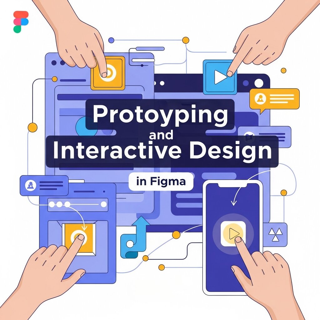 One of the most compelling features of Figma UI design is its built-in prototyping capability. Designers can link frames together, add transitions, and simulate user flows—all within the same file they’re designing in. There’s no need to export to a separate prototyping tool.
This matters because it keeps the feedback loop tight. When a stakeholder or user tester interacts with a Figma prototype, they’re experiencing something that closely resembles the finished product. Click-through prototypes help surface usability issues early, long before development begins.
Advanced features like interactive components and smart animate take this further. Hover states, toggle switches, and animated transitions can all be prototyped natively in Figma, giving teams a richer, more realistic preview of how the final UI will behave.
For product teams working in digital branding design, this level of fidelity is especially useful. A brand’s interaction design—the micro-animations, transitions, and responsive behaviors—can be communicated clearly to developers through Figma prototypes, reducing the risk of inconsistencies at the build stage.
Real-Time Collaboration That Actually Works
It’s worth dwelling on Figma’s collaboration model, because it’s one of the platform’s biggest differentiators. In traditional workflows, design reviews happen asynchronously—a designer shares a file, stakeholders review it later, and feedback accumulates in comment threads that can quickly become unwieldy.
Figma’s real-time multiplayer experience changes the dynamic. Stakeholders can jump into a file during a design review and leave pinned comments directly on the canvas. Designers can respond, resolve feedback, and make live edits—all in the same session. This compresses the feedback cycle dramatically.
The Observer mode, which allows non-designers to follow along as a designer navigates the file, is particularly useful for remote product teams. Presenting a design to a distributed team in a Figma file feels far more interactive than sharing a PDF or a static screenshot.
For agencies managing digital visual design projects across multiple clients, this transparency also builds trust. Clients can access a view-only version of a Figma file at any time, watching the design progress without needing to wait for formal deliverables.
Building and Maintaining a Scalable Design System
As a product matures, design consistency becomes increasingly difficult to maintain—especially when multiple designers are contributing simultaneously. This is where Figma’s design system capabilities truly shine.
Figma allows teams to create a centralized library of components, styles, and assets that can be shared across projects. Typography scales, color tokens, spacing systems, icons—everything lives in one place, and any update flows through automatically to every file that uses those assets.
This kind of structured approach to digital visual design isn’t just about aesthetics. It directly accelerates development. When developers access a Figma file, they can inspect components and retrieve exact measurements, color values, font sizes, and spacing without guesswork. The design-to-development handoff, historically one of the most friction-heavy parts of the product design process, becomes dramatically smoother.
For organizations investing in digital branding design, a well-maintained Figma component library also ensures brand consistency at scale. New screens, new features, and new products can all be built from the same foundational visual language—reducing design debt and keeping the user experience coherent as the product grows.
Speeding Up Developer Handoff with Figma’s Dev Mode
Figma introduced Dev Mode as a dedicated workspace for developers—a view of the design file that surfaces only the information developers need. Precise spacing values, CSS properties, asset export options, and component annotations are all surfaced cleanly, without the clutter of editing tools.
Dev Mode also integrates with popular development environments. Plugins like Figma-to-code generators can automatically convert UI components into React, HTML, or other framework-specific code snippets, further reducing manual translation effort.
This tight loop between Figma UI design and development is one of the clearest indicators of how the platform streamlines the overall product design process. Fewer back-and-forth conversations about implementation details means more time spent building and shipping.
Figma for Digital Media Design: Beyond the Screen
 Figma’s utility extends beyond traditional app and web UI design. As digital media design has expanded to include social media assets, motion graphics mockups, email templates, and interactive presentations, Figma has grown alongside it.
Teams can use Figma to design marketing assets, pitch decks, and campaign materials—applying the same component-based logic that makes product design so efficient. A marketing team working on a product launch can pull brand assets directly from the shared design system, ensuring that digital media deliverables align with the product’s visual identity.
This cross-functional application of Figma makes it more than a UI design tool. For organizations looking to unify their design operations under a single platform, Figma offers a compelling case.
What Are the Common Challenges With Figma, and How Can Teams Overcome Them?
No tool is without its limitations. Figma can feel overwhelming for new users unfamiliar with component architecture or auto layout principles. Teams without an established design system may find that Figma files become disorganized quickly, particularly on larger projects.
The solution is largely structural. Investing time upfront in organizing file hierarchies, naming conventions, and component libraries pays dividends over the life of a project. Many product teams now designate a “design systems lead” whose primary responsibility is maintaining the integrity of the shared Figma library.
Performance can also be a consideration on very large files with complex components and many frames. Breaking projects into multiple linked files—using Figma’s team libraries to maintain consistency across them—is a common workaround that experienced Figma users rely on.
The Future of Figma UI Design in Product Development
Figma continues to evolve rapidly. The introduction of Figma AI features—including automated design suggestions, content generation, and layout tools—signals a future where routine design tasks are accelerated further, freeing designers to focus on higher-order decisions.
As digital products grow more complex and user expectations continue to rise, the ability to design, prototype, test, and iterate quickly will only become more valuable. Figma’s position at the center of modern UI design workflows makes it well-placed to remain the platform of choice for product teams who prioritize speed and collaboration.
Frequently Asked Questions (FAQs)
1. What is Figma UI design?
Figma UI design is the process of creating user interfaces for websites, mobile apps, and digital products using Figma. It enables designers to build wireframes, interactive prototypes, design systems, and high-fidelity interfaces while collaborating with team members in real time.
2. Why is Figma popular among UI/UX designers?
Figma is popular because it’s cloud-based, supports real-time collaboration, offers powerful prototyping features, and simplifies developer handoff. Its browser-based workflow and shared design libraries make it ideal for teams working on digital products.
3. Can Figma be used for both UI and UX design?
Yes. Figma supports both UI and UX design. Designers can create user flows, wireframes, interactive prototypes, high-fidelity interfaces, design systems, and usability testing prototypes—all within a single platform.
4. What are the key features of Figma for UI design?
Some of Figma’s most valuable features include Auto Layout, Components and Variants, Design Systems, Interactive Prototyping, Dev Mode, Team Libraries, Smart Animate, Version History, and real-time collaboration, all of which improve design efficiency and consistency.
5. Is Figma suitable for beginners?
Absolutely. Figma has an intuitive interface, extensive learning resources, and a free plan that makes it an excellent choice for beginners. As designers gain experience, they can gradually explore more advanced features like Auto Layout, Variables, Components, and Design Systems.
6. How does Figma improve collaboration between designers and developers?
Figma allows designers, developers, product managers, and stakeholders to work from the same design file. Developers can inspect designs, copy measurements, export assets, and access design specifications directly, reducing communication gaps and speeding up development.
7. Can Figma be used for responsive web and mobile app design?
Yes. Figma is widely used to design responsive websites, mobile applications, dashboards, SaaS products, and desktop interfaces. Designers can create layouts for multiple screen sizes while maintaining consistent design systems across devices.
8. What is a Figma design system?
A Figma design system is a centralized collection of reusable UI components, typography styles, colors, icons, spacing rules, and design guidelines. It helps teams maintain visual consistency, accelerate design workflows, and simplify product scaling across multiple projects.
9. How does Figma support prototyping?
Figma includes built-in prototyping tools that allow designers to connect screens, add transitions, create interactive components, simulate user journeys, and test product experiences before development begins. This helps identify usability issues early in the design process.
10. Why should businesses choose Figma for product design?
Figma streamlines the entire product design workflow by combining collaboration, interface design, prototyping, design systems, and developer handoff into one platform. Businesses benefit from faster project delivery, improved communication, consistent branding, reduced development errors, and a more efficient design process.
Build Better Products Faster With Figma
 Figma UI design has reshaped what it means to build a digital product. By centralizing collaboration, prototyping, design systems, and developer handoff in a single platform, Figma removes many of the friction points that slow product teams down.
If your team is still navigating siloed tools and lengthy feedback cycles, exploring Figma’s full feature set is a practical next step. Start by auditing your current design workflow—identify where handoffs break down, where version confusion creeps in, and where feedback gets lost. Chances are, a well-structured Figma workflow addresses most of those gaps directly.


