
From hand-drawn mockups to AI-generated interfaces, digital visual design has undergone one of the most dramatic transformations in creative history. What started as a functional discipline—focused purely on making things work on a screen—has evolved into a rich, strategic craft that shapes how billions of people interact with technology every day.
This post traces that evolution, exploring how design tools, trends, and philosophies have changed over time. Along the way, you’ll find inspiration for your own digital product design ideas, a look at where the discipline is heading, and a sense of why understanding design history makes you a sharper, more intentional designer today.
Whether you’re a seasoned professional, a curious student, or someone exploring digital product design books for the first time, there’s something here worth knowing.
The Early Days: Designing for Constraints
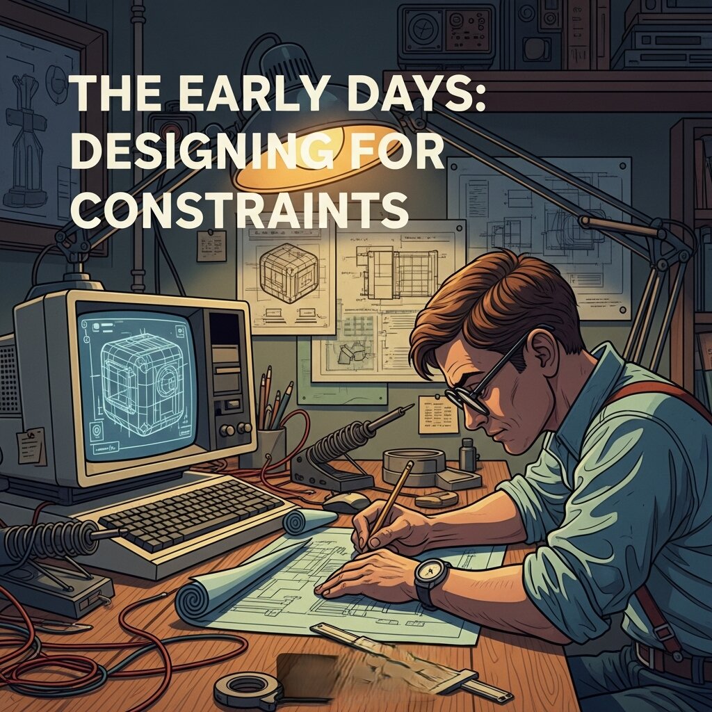 The story of digital visual design doesn’t begin with sleek interfaces and Figma prototypes. It begins with severe limitations.
In the 1970s and 1980s, designers working on early personal computers had to contend with extremely low screen resolutions, a limited color palette, and hardware that could barely keep up with basic rendering. The visual language of this era was defined by pixel art, monochrome displays, and bitmapped typography.
Susan Kare, who designed the original icons for the Apple Macintosh in 1984, is one of the most celebrated figures from this period. Her work demonstrated that even within tight technical constraints, design could carry personality and clarity. The trash can, the paint bucket, the smiling Mac face—these weren’t just functional icons. They were the beginning of a visual vocabulary for human-computer interaction.
The discipline was not yet called “digital visual design.” It lived awkwardly between graphic design, computer science, and interface engineering. But the seeds were planted.
The Web Era: Design Meets the Browser
The launch of the World Wide Web in the early 1990s changed everything. Suddenly, design had to function across different browsers, screen sizes, and internet connection speeds. This introduced constraints of a new kind—not just technical, but logistical.
Early websites were, frankly, chaotic. Tiled background images, blinking text, clashing colors, and heavy use of HTML tables defined the aesthetic of the mid-to-late ’90s. But this chaos was also a laboratory. Designers were figuring out what worked, what didn’t, and what the medium was actually capable of.
The introduction of CSS (Cascading Style Sheets) in 1996 was a turning point. For the first time, visual presentation could be separated from content structure. Designers gained more control, and the profession began to mature.
By the early 2000s, tools like Macromedia Flash gave designers the ability to create rich, animated web experiences. Flash-powered websites were technically impressive and visually bold—but they also loaded slowly, weren’t accessible, and didn’t play well with search engines. When Apple refused to support Flash on the iPhone in 2007, the technology’s decline was sealed.
The Rise of User-Centered Design
 The mid-2000s brought a critical philosophical shift: design stopped being primarily about aesthetics and started being about the user.
Don Norman’s book The Design of Everyday Things, first published in 1988 but widely adopted in design education throughout the 2000s, gave the industry a framework for thinking about usability. His concept of “affordances”—the idea that design should communicate how something works—became central to digital product design ideas that prioritized function over form.
This era saw the rise of user experience (UX) as a formal discipline. Companies like Google and Amazon were investing heavily in understanding how users actually navigated digital products. A/B testing, usability studies, and user research became standard practice.
Visually, this translated to cleaner, more minimal interfaces. Clutter was stripped away. Navigation became more intuitive. Typography got more attention. The goal was to reduce friction—to make the digital experience feel effortless.
Flat Design vs. Skeuomorphism: The Great Debate
One of the most visible battles in modern digital visual design took place around 2012–2014: the clash between skeuomorphism and flat design.
Skeuomorphism, popularized by Apple under Steve Jobs, involved designing digital interfaces to mimic real-world objects. The Notes app looked like a legal pad. The Bookshelf app displayed actual wooden shelves. The goal was to make digital objects feel familiar and intuitive by grounding them in physical reality.
Flat design, championed by Microsoft’s Metro design language and later by Google’s Material Design, rejected this approach entirely. It stripped away gradients, shadows, and textures in favor of clean geometry, bold colors, and crisp typography. The argument was that users had become fluent enough with digital interfaces that they no longer needed physical metaphors as a crutch.
Apple’s iOS 7, released in 2013, marked a dramatic shift toward flat design. The backlash was fierce and immediate—many users found the new interface disorienting. But the direction stuck, and the broader design industry followed.
Today, most interfaces sit somewhere between the two extremes. Subtle shadows and depth cues (sometimes called “neumorphism”) have made a comeback, but the core principles of flat design—clarity, hierarchy, intentionality—remain dominant.
Motion Design and Microinteractions: Design That Responds
 Static design gave way to dynamic design. As devices became more powerful and internet speeds increased, designers gained the ability to build interfaces that moved, responded, and felt alive.
Microinteractions—small, purposeful animations that respond to user behavior—became a major focus of digital product design ideas in the 2010s. A button that subtly bounces when tapped. A loading bar that fills with personality. A form field that shakes when a password is incorrect. These moments might seem trivial, but they communicate responsiveness and build trust.
Motion design expanded beyond microinteractions into full interface choreography. Transitions between screens, scroll-triggered animations, and parallax effects became tools for guiding attention and creating a sense of narrative within digital products.
Dan Saffer’s Microinteractions: Designing with Details—one of the more influential digital product design books of the decade—articulated why these small moments mattered so much. Every interaction is a chance to delight, clarify, or reassure the user. Done well, microinteractions make a product feel polished and human.
Responsive and Inclusive Design: Building for Everyone
The explosion of mobile devices in the early 2010s forced another major rethink. Designers could no longer optimize for a single screen size. A website or app needed to work beautifully on a 4-inch smartphone screen, a 13-inch laptop, and a 27-inch monitor.
Responsive design—the practice of building layouts that adapt fluidly to any screen size—became a fundamental skill. Ethan Marcotte’s 2011 book Responsive Web Design codified the approach and remains one of the essential digital product design books in the field.
Alongside responsiveness came a growing awareness of accessibility. Designing for disability had long been treated as an afterthought. Gradually, it became a professional and ethical responsibility. WCAG (Web Content Accessibility Guidelines) gave designers a concrete standard to work toward. Color contrast ratios, keyboard navigation, screen reader compatibility, and alt text for images all became parts of the digital visual design checklist.
Inclusive design broadened this thinking further. Rather than asking “how do we make this accessible to people with disabilities?”, it asked “how do we design for the full range of human diversity?” The result was better products for everyone.
The Era of Design Systems
As digital products scaled in complexity, ad hoc design decisions became unsustainable. A button designed one way in one part of an app, and a slightly different way in another, created inconsistency and confusion. The solution was the design system.
A design system is a comprehensive set of standards, components, and guidelines that governs how a product looks and behaves. Google’s Material Design, IBM’s Carbon Design System, and Atlassian’s Design System are prominent examples. These systems don’t just define visual styles—they define interaction patterns, accessibility standards, and writing guidelines.
Design systems shifted digital visual design from individual creativity toward collaborative, systematic thinking. They also blurred the line between design and development, with tools like Figma, Storybook, and Zeroheight enabling tighter collaboration between the two disciplines.
For designers generating digital product design ideas today, working within—or building—a design system is often part of the job.
AI and the Future of Digital Visual Design
Artificial intelligence is now reshaping digital visual design in ways that are still unfolding. Tools like Adobe Firefly, Midjourney, and Figma’s AI-powered features are changing how designers generate ideas, prototype layouts, and produce assets.
Some fear that AI will replace designers. A more grounded view is that it will change what designers spend their time on. Routine production tasks—resizing assets, generating variations, creating initial mockups—are increasingly automatable. This frees designers to focus on higher-order work: strategy, storytelling, user psychology, and ethical decision-making.
The designer of the future will need a strong grasp of both creative and analytical thinking. They’ll need to know when to trust an AI-generated suggestion and when to override it. And they’ll need a deep understanding of design history—because knowing where visual design has been is the clearest guide to where it’s going.
The Growing Demand for Digital Visual Designers
As businesses continue shifting their operations online, the demand for skilled digital visual designers is growing rapidly. Companies need professionals who can create engaging user interfaces, compelling brand identities, and memorable digital experiences that stand out in competitive markets.
This demand extends across industries—from technology and e-commerce to healthcare, education, and entertainment. Freelancing opportunities have also expanded, allowing designers to work with clients worldwide and build flexible careers.
For aspiring designers, this means the field offers both creative fulfillment and strong career prospects. Developing expertise in typography, user experience, motion design, and emerging technologies can open doors to a wide range of opportunities. As digital products become more sophisticated, the ability to combine creativity with strategic thinking will remain one of the most valuable skills in the modern workforce.
FAQ: Digital Visual Design
1. What is digital visual design?
Digital visual design is the practice of creating visual elements for digital platforms such as websites, mobile apps, social media, and digital products to communicate ideas effectively and enhance user experiences.
2. How is digital visual design different from graphic design?
While graphic design covers both print and digital media, digital visual design focuses specifically on screen-based experiences, emphasizing interactivity, responsiveness, and user-centered design.
3. Why is digital visual design important for businesses?
Effective digital visual design helps businesses strengthen their brand identity, improve user engagement, increase conversions, and create memorable customer experiences across digital channels.
4. What skills are essential for a digital visual designer?
Key skills include typography, color theory, layout design, user interface (UI) principles, motion design, prototyping, and proficiency with design tools like Figma, Adobe Creative Cloud, and Sketch.
5. What are the most popular tools used in digital visual design?
Popular tools include Figma, Adobe Photoshop, Adobe Illustrator, Adobe XD, Sketch, Canva, and AI-powered platforms that assist with design automation and content creation.
6. How has AI changed digital visual design?
AI has streamlined repetitive tasks such as image editing, asset generation, and layout suggestions, allowing designers to focus more on creativity, strategy, and user experience.
7. What is responsive design in digital visual design?
Responsive design is the practice of creating layouts that automatically adapt to different screen sizes and devices, ensuring a consistent and user-friendly experience.
8. What is a design system, and why is it important?
A design system is a collection of reusable components, guidelines, and standards that ensure consistency across digital products while improving collaboration between designers and developers.
9. How does accessibility influence digital visual design?
Accessibility ensures digital products are usable by everyone, including people with disabilities, through features like readable typography, proper color contrast, keyboard navigation, and screen-reader compatibility.
10. What is the future of digital visual design?
The future of digital visual design includes AI-assisted workflows, immersive AR/VR experiences, advanced motion design, and a stronger focus on accessibility, sustainability, and human-centered design.
Design Continues to Evolve—and So Should You
The evolution of digital visual design is not a straight line. It’s a series of reactions, overcorrections, rediscoveries, and genuine breakthroughs. Every era responded to the limitations and excesses of the one before it.
What’s consistent across all of it is this: the best digital visual design puts the human experience first. Tools change. Trends come and go. But the goal of making technology feel intuitive, beautiful, and accessible remains constant.


