
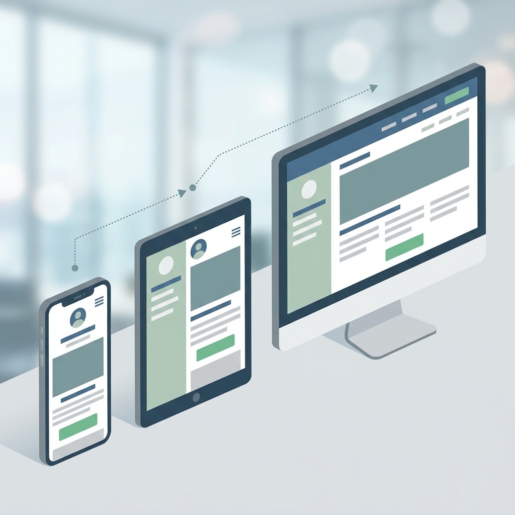
Mobile devices have become a central part of how people browse websites, discover products, compare services, read content, and complete purchases. As users increasingly interact with businesses through smartphones and tablets, websites need to provide fast, intuitive, and accessible experiences across smaller screens. This is where mobile-first design becomes an important strategy for modern businesses.
Mobile-first design focuses on creating the website experience for mobile devices before expanding the layout for larger screens. Instead of designing a desktop website and later trying to adapt it to mobile, designers prioritize essential content, simple navigation, touch-friendly interactions, and efficient performance from the beginning.
What Is Mobile-First Design?
Mobile-first design is a web design approach where designers begin by creating the user experience for smaller screens and then progressively enhance it for tablets, laptops, and desktop devices. The approach prioritizes essential content and functionality.
Prioritizing Mobile Users
Mobile-first design starts by identifying what users need most when accessing a website on a smartphone. Designers focus on important content, simple navigation, readable typography, and clear calls to action before adding larger-screen enhancements.
Creating Responsive Experiences
Responsive design allows website layouts to adapt to different screen sizes. A mobile-first approach ensures that responsive behavior is considered from the beginning rather than being added as an afterthought.
Simplifying Digital Interfaces
Small screens have limited space, so unnecessary elements can create confusion. Mobile-first design encourages businesses to simplify menus, forms, buttons, images, and content structures to create clearer user experiences.
Why Mobile-First Design Matters for Engagement
 Engagement depends heavily on how easily visitors can interact with a website. A confusing or slow mobile experience can cause users to leave before exploring the available content or services.
Improving User Convenience
Mobile users often browse while commuting, shopping, comparing products, or looking for quick information. A well-designed mobile interface makes it easier to find important information and complete actions without unnecessary steps.
Reducing User Friction
Every unnecessary click, confusing menu, or difficult form can create friction. Mobile-first design removes obstacles by making navigation, content discovery, and interaction more straightforward.
Supporting Longer Sessions
When a website feels comfortable and intuitive on a smartphone, users are more likely to explore additional pages. Better usability can encourage visitors to interact with products, services, articles, and other website content.
How Mobile-First Design Increases Conversions
Conversions happen when users complete valuable actions such as purchasing a product, submitting a form, booking a service, subscribing to a newsletter, or requesting information. Mobile-first design can make these actions easier.
Designing Clear Calls to Action
Calls to action should be visible, understandable, and easy to tap. Mobile-first design helps businesses position buttons strategically so users can recognize the next step without searching through crowded layouts.
Simplifying Checkout Processes
Mobile shoppers can abandon purchases when checkout forms are complicated. Reducing unnecessary fields, using appropriate input types, and providing clear progress indicators can make mobile checkout more convenient.
Making Forms Mobile Friendly
Forms should be designed around mobile interaction. Large input areas, clear labels, logical field order, and suitable keyboard types can reduce frustration and help users complete submissions more efficiently.
The Connection Between Mobile-First Design and Interactive Digital Design
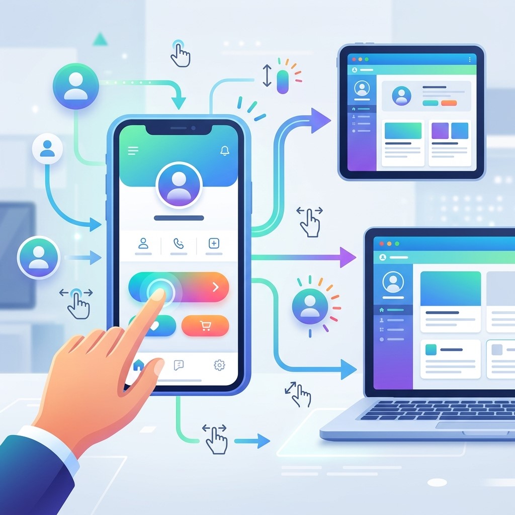 Interactive digital design focuses on creating digital experiences that encourage users to interact with content, interfaces, animations, buttons, menus, and other elements. Mobile-first thinking helps ensure these interactions work naturally on touchscreens.
Creating Touch-Friendly Interactions
Mobile users interact primarily through taps, swipes, and gestures. Buttons and interactive elements should have sufficient space and clear visual states so users can interact with them comfortably.
Using Animation Carefully
Animations can improve feedback and guide attention when used appropriately. However, excessive motion can distract users or negatively affect performance, so mobile-first experiences should prioritize purposeful interactions.
Improving Navigation
Interactive menus, filters, accordions, and tabs can organize information without overwhelming small screens. These elements should remain intuitive and easy to operate with touch controls.
Mobile-First Design and Digital Media Design
Digital media design combines visual elements such as images, graphics, video, typography, and other media to communicate information. Mobile-first principles help ensure that these assets work effectively across smaller screens.
Optimizing Images
Large images can slow down mobile pages and consume valuable bandwidth. Responsive image techniques and appropriate file sizes can help maintain visual quality while improving loading performance.
Designing Readable Visual Content
Text embedded within graphics should remain readable on small screens. Designers need to consider font size, contrast, spacing, and image proportions when creating digital media for mobile audiences.
Balancing Visuals and Performance
Visual content can make websites more engaging, but excessive media can negatively affect performance. Mobile-first design encourages designers to balance visual impact with fast loading and smooth interaction.
Mobile-First Design and Digital Branding Design
A strong mobile website should communicate a consistent brand identity while remaining easy to use. Digital branding design helps businesses maintain recognizable visual elements across their digital touchpoints.
Maintaining Brand Consistency
Colors, typography, logos, imagery, and design patterns should remain consistent across mobile and desktop experiences. Consistency helps users recognize the brand and builds familiarity.
Building Brand Trust
A polished mobile interface can make a business appear more professional and reliable. Clear content, consistent visuals, responsive interactions, and accessible information can strengthen user confidence.
Creating Memorable Experiences
Branding should extend beyond logos and colors. A distinctive mobile experience can help businesses create memorable interactions that encourage users to return and engage with the brand.
Key Elements of an Effective Mobile-First Website
Successful mobile-first design requires more than simply shrinking a desktop layout. It involves designing an experience specifically around mobile behavior and limitations.
Responsive Layouts
Responsive layouts allow content to adapt to different screen widths. Flexible grids, scalable images, and responsive typography help maintain usability across smartphones, tablets, and larger displays.
Simple Navigation
Mobile navigation should be easy to understand. A well-structured menu should help users reach important pages quickly without requiring excessive scrolling or complicated interactions.
Readable Typography
Typography needs to remain comfortable on smaller screens. Appropriate font sizes, line heights, spacing, and contrast can improve readability and encourage users to consume more content.
Fast Loading Performance
Page speed strongly influences user experience. Compressing images, minimizing unnecessary scripts, optimizing code, and using efficient hosting can help websites load faster on mobile connections.
How Mobile-First Design Supports SEO
 Search engines evaluate many aspects of website usability and performance. A mobile-friendly experience can support stronger visibility by helping users access and interact with website content effectively.
Improving Mobile Usability
A website that works smoothly on mobile devices provides a better experience for visitors. Clear navigation, readable content, responsive layouts, and accessible interactions can contribute to stronger overall usability.
Supporting Better Performance
Performance optimization can reduce delays and improve the browsing experience. Businesses should pay attention to loading speed, image optimization, scripts, caching, and other technical factors.
Creating Better Content Experiences
Mobile-first design encourages businesses to structure content clearly. Shorter paragraphs, descriptive headings, visual hierarchy, and easy navigation can make long-form content easier to consume on smaller screens.
Common Mobile-First Design Mistakes
Even businesses that understand the importance of mobile optimization can make design decisions that negatively affect usability. Identifying common mistakes can help create stronger digital experiences.
Overloading Small Screens
Trying to include every desktop element on a mobile screen can create clutter. Designers should prioritize essential information and remove elements that do not contribute to the user’s primary goals.
Using Tiny Buttons
Small buttons can be difficult to tap accurately. Interactive elements should provide enough space for comfortable touch interaction and should be visually distinguishable from surrounding content.
Ignoring Mobile Forms
Complex forms can discourage users from completing important actions. Businesses should reduce unnecessary fields and make every input easy to understand and operate.
Using Too Many Pop-Ups
Intrusive pop-ups can interrupt the user experience, especially on small screens. Promotional messages should be carefully timed and designed so that users can easily dismiss them.
Best Practices for Mobile-First Design
Following practical design principles can help businesses create mobile experiences that support engagement, usability, and conversions.
Start With User Goals
Designers should identify what mobile visitors are trying to accomplish. Understanding these goals makes it easier to prioritize content, navigation, functionality, and calls to action.
Design From Small to Large
Starting with the smallest practical screen encourages designers to focus on essential functionality. Additional features and visual enhancements can then be introduced for larger displays.
Test Across Devices
A website should be tested on different screen sizes, operating systems, browsers, and connection conditions. Testing helps identify layout, navigation, performance, and interaction problems.
Measure User Behavior
Analytics tools can reveal where users enter, leave, scroll, click, or abandon conversion processes. These insights can help businesses identify opportunities for continuous mobile optimization.
Mobile-First Design for Ecommerce Businesses
Ecommerce companies can benefit significantly from mobile-first design because customers increasingly discover and purchase products through mobile devices.
Improving Product Discovery
Mobile product pages should make important information easy to find. Product images, pricing, descriptions, reviews, availability, and purchase options should be presented in a clear hierarchy.
Simplifying Mobile Shopping
Users should be able to browse categories, search for products, apply filters, and add items to carts without unnecessary complexity. A simple shopping journey can reduce abandonment.
Building Purchase Confidence
Mobile shoppers need clear information about payment methods, delivery, returns, security, and product quality. Providing this information in an accessible format can increase confidence during purchasing decisions.
Measuring the Success of Mobile-First Design
Businesses need measurable indicators to understand whether their mobile design improvements are producing meaningful results.
Tracking Engagement Metrics
Metrics such as session duration, pages per session, scroll depth, and interaction rates can provide insight into how visitors engage with mobile content.
Monitoring Conversion Rates
Businesses can compare mobile conversion rates before and after design improvements. Tracking purchases, registrations, form submissions, and other key actions helps evaluate business outcomes.
Analyzing Mobile Abandonment
High abandonment rates can indicate problems with navigation, performance, forms, checkout, or content clarity. Analyzing user journeys can help identify where improvements are needed.
The Future of Mobile-First Design
 Mobile-first design will continue evolving as users adopt new devices, interfaces, and digital behaviors. Businesses will need to create experiences that are increasingly personalized, accessible, fast, and interactive.
AI-Powered Experiences
Artificial intelligence can help personalize content, recommendations, customer support, and user journeys. Mobile-first interfaces can incorporate intelligent features while maintaining simplicity.
More Advanced Interactions
Touch, voice, gesture, and other interaction methods may become increasingly common. Designers will need to consider multiple interaction patterns while keeping experiences accessible and intuitive.
Greater Focus on Accessibility
Accessible mobile design benefits users with different abilities and preferences. Clear contrast, readable typography, keyboard support, alternative text, and accessible interactions can create more inclusive experiences.
Frequently Asked Questions
What is mobile-first design?
Mobile-first design is a website design approach that begins with the mobile experience before expanding the interface for larger screens. It prioritizes essential content, simple navigation, performance, touch interactions, and usability.
Why is mobile-first design important?
Mobile-first design is important because many users access websites through smartphones. A well-optimized mobile experience can improve usability, engagement, customer satisfaction, and conversion opportunities.
Does mobile-first design improve conversions?
Yes. By simplifying navigation, forms, checkout processes, and calls to action, mobile-first design can reduce friction and make it easier for visitors to complete valuable actions.
How does mobile-first design improve SEO?
Mobile-first design can support better usability, performance, accessibility, and content consumption. These factors contribute to a stronger overall website experience and can support search visibility.
What is interactive digital design?
Interactive digital design focuses on creating digital experiences where users actively interact with elements such as buttons, menus, animations, forms, filters, and other interface components.
How does digital media design work with mobile-first design?
Digital media design creates visual content such as graphics, images, video, and typography. Mobile-first principles ensure these elements remain readable, responsive, optimized, and useful on smaller screens.
What is digital branding design?
Digital branding design involves creating consistent visual and interactive brand experiences across digital platforms. It includes elements such as typography, colors, imagery, layouts, logos, and design patterns.
Is mobile-first design the same as responsive design?
They are related but different. Responsive design allows layouts to adapt across screen sizes, while mobile-first design starts the design process with mobile users and progressively enhances the experience for larger screens.
How can businesses improve their mobile website?
Businesses can improve mobile websites by simplifying navigation, optimizing images, improving loading speed, creating readable content, making buttons touch-friendly, simplifying forms, and regularly testing different devices.
How do you measure mobile-first design success?
Success can be measured through mobile engagement, conversion rates, bounce or abandonment patterns, page performance, user behavior, form completion, ecommerce purchases, and other business-specific metrics.
Conclusion
Mobile-first design has become an important strategy for businesses that want to improve digital engagement and conversions. By designing around mobile users first, organizations can create cleaner navigation, faster experiences, clearer calls to action, and more convenient conversion journeys.
The approach also strengthens interactive digital design, digital media design, and digital branding design by ensuring that visual and interactive experiences work effectively on smaller screens. From ecommerce websites to service businesses and content platforms, mobile-first thinking can improve how customers discover, understand, and interact with digital experiences.


